Aligning Workflows with User Needs
When a system fails to match user workflows, productivity suffers. This redesign focused on creating a seamless navigation experience through a user-friendly dashboard, intuitive navigation structure, and improved account search functionality. These updates empower users to work smarter, not harder.


CLIENT Digital Ad Company
ROLE UX Designer Lead
Project Overview
This project aims to enhance the system’s entry point and navigation to address user pain points, improve usability, and align with both user and business needs. By streamlining account search, offering multiple access points, and standardizing navigation, the redesign delivers a more efficient, intuitive, and user-centered experience.
The Problem
The current ad centralized system presents several usability challenges that hinder user experience. Upon logging in, users are greeted only by a search bar, with no contextual information or clear instructions, leaving them unsure of how to proceed. Furthermore, users must already know their account type in advance to search for the appropriate account, creating an unnecessary barrier for new or less experienced users. To make matters worse, the system’s navigation structure and labeling are confusing, making it difficult for users to easily find and manage key functions like campaign setup, budget allocation, and strategy management. These issues significantly disrupt workflow and reduce the efficiency of the advertising operations. Our project seeks to address these pain points by improving the entry point and enhancing overall usability to make the system more intuitive and accessible for all users.
Our Solution
To streamline workflows and provide an efficient entry point for users managing numerous accounts daily, while also updating the system’s features to align with industry standards, we implemented the following solutions:
Introducing a Dashboard as a Central Hub
-
The new dashboard serves as an effective navigation hub, offering key features and performance overviews.
-
Users can quickly address underperforming strategies, resolve posting issues, and access their favorite accounts in one centralized location, enhancing efficiency and convenience.
Updating the Navigation Structure (IA) and Labeling
-
The redesigned navigation structure includes updated labels that align with user workflows and industry-standard terminology.
-
These changes improve clarity, reduce cognitive load, and ensure consistency throughout the system.
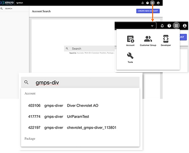
Enhancing the Account Selector (Search)
-
The account selector has been relocated to a more accessible position for ease of use.
-
The search and selection process has been streamlined, with clearer and more distinct account information to help users quickly and accurately identify their desired accounts.

You can explore the updated design through this prototype link.
How do we get there?
Understanding the Problem
To identify opportunities for improvement, we utilized the following research methods:

User Interviews
These allowed us to uncover user pain points and needs while interacting with the system.
Closed Card Sorting
With 23 pages in the account-level section and 47 pages in the global tools section, this method helped us understand how users logically group items within the system. Additionally, it provided insights into whether the existing labels are meaningful to users.
Heuristic Evaluation
Given that the system has not been updated for a significant period, we evaluated its usability to identify issues and areas that require improvement.
Key Findings
Through our research, we identified the following key insights:

Difficulty in Locating Client Accounts
-
Account Variety: Some users manage over 30 assigned accounts, while others operate without assigned accounts, selecting them from a queue instead.
-
Inconsistent Account Search Location: The account search feature in the side navigation is not aligned with other tools, making it difficult to locate.
-
Increased Cognitive Load: Users must first identify the account type before searching, adding complexity to the process. Additionally, multiple accounts sharing the same web ID often result in incorrect selections.
-
Unclear Labels and Information: Labels and account details in search results lack clarity, further complicating the user experience.

Complex System Structure
-
Overwhelming Number of Pages: The system’s structure—comprising 23 pages in the account-level section and 47 pages in the global tools section—adds to the cognitive load, making it challenging for users to navigate to the desired page.
-
Confusing Navigation Labels: The use of acronyms and non-industry-standard terms in navigation labels increases confusion, particularly for new users, who find it harder to learn and navigate the system.

Feature Gaps
-
Performance Indicators: The spending pacing metric and other downstream data are highly valuable for users in managing campaign strategies, but these features are notably missing from the system.
-
Lacking of Notifications: Users expressed a need for notifications regarding issues like missing impressions or spending pace irregularities.
-
Dependence on External Platforms: Users frequently rely on external platforms to gather performance data, highlighting gaps in system capabilities.
Identifying Our Users
With all these research findings, we went on to develop a fictitious person that helps personify a representation of our target audience.
Emily
Age 34 • Digital Advertising Analyst
Emily works as a digital advertising analyst for over 4 years, managing multiple advertising accounts across various platforms. Her daily responsibilities include monitoring campaign performance, optimizing ad spend, and delivering reports to clients and internal teams. Emily relies on tools that provide quick, accurate insights to meet tight deadlines and achieve campaign goals efficiently.

Goals:
-
Efficiently manage a large number of accounts with minimal cognitive load.
-
Quickly identify and resolve issues, such as pacing problems or missing impressions.
-
Access all relevant performance data within a single platform, reducing dependence on external tools.
-
Customize performance views to match the needs of different strategies and business verticals.
-
Navigate the system easily, with clear labels and intuitive structures that minimize confusion, especially for new team members.
-
Receive timely notifications for critical issues affecting campaign performance.
Pain Points:
-
Struggles to keep track of over 30 accounts daily
-
Finds it frustrating to navigate inconsistent account search features and unclear labeling.
-
Experiences delays and confusion due to truncated account details and poor visual hierarchy in search results.
-
The extensive number of pages / tools in the system creates confusion about where to go or which tools to use for different accounts. This often forces her to rely on colleagues for guidance, slowing down her workflow and increasing frustration.
-
Frequently relies on external platforms to gather performance data, which disrupts workflow and slows decision-making.
-
Misses important issues like pacing irregularities due to a lack of notification features, increasing the risk of campaign underperformance.
This persona embodies the target user for the redesigned system, ensuring the design requirements align with real-world needs and expectations.
Design Process
After identifying the design requirements based on the key findings, we began ideating solutions. Recognizing that the entry point of a platform tool is the first interface or screen users encounter, we understood its critical role as a starting point for navigation and feature utilization.

Account type has to be selected before using search
Users must first determine the account type before searching, which adds unnecessary complexity and creates a barrier to starting their workflow.
The current entry point of the system imposes a significant cognitive load on users, prompting us to focus our design efforts on the following areas:

Simplifying the Account Search Process
Introducing a homepage (dashboard) to provide quick access to key information and enhancing the search functionality for a more seamless user experience.

Redesigning the Navigation IA (Information Architecture)
Restructuring the information architecture (IA) of the navigation to better align with users' workflows while renaming labels to reflect industry-standard terms for improved clarity and consistency.
Ready for ideating!
To enhance usability, we plan to move the account search feature to the header, providing consistent and convenient access while aligning with the design patterns of other company platform tools. Additionally, we will improve the search result display to enable users to efficiently locate and select the desired account.

This led us to reimagine the system’s entry point. Through a feature comparison with industry-leading platforms, we discovered that most utilize dashboards as access hubs for easy navigation. Inspired by this insight, we decided to design a dashboard that would serve as a central hub, enabling users to navigate the system more efficiently.

To ensure the dashboard design aligns with users' needs, we conducted a feature prioritization exercise using dot voting with users to identify the most important features for the homepage. This approach provided valuable insights into user priorities and guided our design decisions.
.jpg)
Additionally, we employed the MoSCoW Method with project stakeholders and development team to ensure that the features users desired were aligned with time and resource constraints.
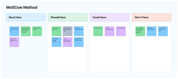
Our Design
Based on the insights gained from the feature prioritization exercise and the MoSCoW method, we refined our understanding of the key features to incorporate into our design. We decided to focus on three major areas:
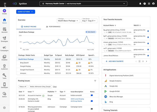
/01 Account Selector
Enhancing the existing search functionality and improving the search result display to streamline the account search process and reduce user effort.
Current Design
-
Users are required to identify the account type before searching, which adds cognitive load.
-
Multiple accounts can share the same web ID, leading to mistakenly selecting the wrong account.
New Design

-
Move the account selector to the header for easier access
-
Streamline the account searching and selecting process.
-
Provide distinct and clear information about accounts to help users identify their desired account.
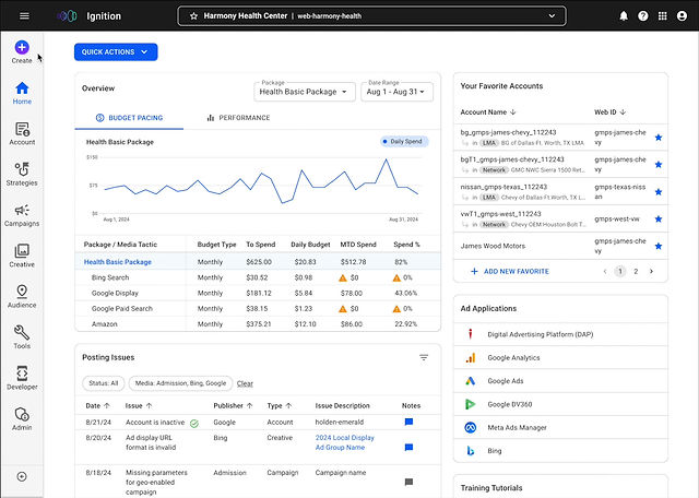
/02 Dashboard (Default) Page
Instead of limiting the entry point to an account search, we designed a comprehensive dashboard to serve as a central hub, helping users navigate to different pages more efficiently.
Current Design

-
Currently, the homepage only provides a search bar for users.
-
Important features, updates, or shortcuts are absent, limiting users' ability to discover key functionalities or new areas of interest.
New Design

-
Enhance the homepage design with insightful data, quick access shortcuts, feature updates, and tutorials to improve overall user experience and efficiency.
/03 Side Navigation And Labeling
Leveraging insights from the closed card sorting exercise, we redesigned the navigation structure to better align with user workflows and updated the labels to improve clarity and usability.
Current Design

-
The category items are currently hidden under the app icon in the header, requiring an extra click to access. This lack of immediate visibility into available options can cause user confusion and frustration.
-
The navigation structure’s misalignment with user workflow sequence, and unintuitive labeling increases cognitive load and reduce user satisfaction.
New Design

-
Relocate the category items originally hidden under the app icon in the header to the side navigation for easier access and improved visibility.
-
Redesign the navigation structure to better align with user workflows and use more descriptive labels to clarify feature content and match existing ad tech standards.
-
Add an option to hide the navigation for more screen space when needed.
How can we validate our design?
Validating Our Design
To validate our design, we conducted usability testing and tree testing with 12 actual users from various roles, each with unique needs and varying levels of experience with the system, ranging from 3 months to 8 years. Including users with diverse experience levels allowed us to assess the intuitiveness of the design, ensuring it meets the needs of both new and long-time users.
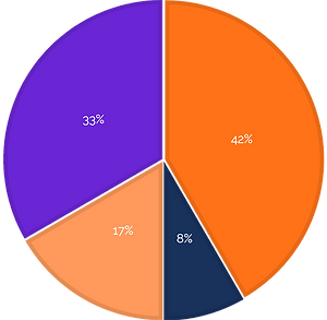
Digital Advertising Analyst
Manage strategies/campaigns, allocate budgets, and monitor and optimize strategy performance
Onboarding Specialist
Create account, activate strategies and set up campaigns and budgets
Digital Ad Campaign Specialist
Build and maintain all advertising templates
Digital Performance Strategist
Collaborate with clients, offer strategic recommendations based on their requests and account performance, with limited system access
Chart showing the percentage breakdown of participants in this testing
During testing, we focused on the following areas:

/01 First Impressions of the Homepage
Evaluating users' initial reactions to the redesigned homepage.
/02 Homepage Features
Validating new features, such as budget pacing and performance overviews, campaign posting issue alerts, and the favorite account editing feature. We aimed to determine whether the data provided in the overview was valuable and sufficient for users, and whether the favorite account functionality was intuitive.

/03 Account Selector (Search)
Assessing whether the updated account selector significantly improves the ease of locating accounts.

/04 Side Navigation and Labeling
Verifying whether the redesigned navigation structure and updated labeling help users locate information more easily and navigate the system more efficiently.
What We Learned
What Worked Well

Usability
The design is clean, intuitive, and user-friendly. Features like "My Favorite Accounts" and the account selector enhance the ease of switching between accounts

Helpful Features
The inclusion of "My Favorite Accounts," the account selector, budget pacing, and performance overview significantly boosts user satisfaction and efficiency.

Informative
The homepage provides users with valuable and relevant information.
What Needs Improvement
Dashboard Design

Some frequently used features and key ad applications are missing from the Quick Action button and ad application list.

The posting issues table does not align with user expectations.

The placement of the "Create" button led participants to perceive it as account-specific.

The account status visibility within the account selector is low.

Data breakdowns on graphs have low discoverability.
Side Navigation and Labeling
Limited clarity on using the hamburger menu icon to toggle the side navigation.

Some labels were unclear to participants.

Placing "Strategies," "Campaigns," and "Creatives" under the account category caused confusion.

The new location of the "Tools" category led to user uncertainty.
Final Design
Impact
The design was overwhelmingly well-received by the actual users, with:
Users shared positive feedback, describing the design as easy to navigate and comprehensive. Many appreciated how the updated system streamlined their workflows and provided a more intuitive experience. This alignment with industry standards not only enhances usability but also ensures the system meets professional expectations.
This project is now being handed off to the development team for implementation, marking a significant step toward improving the user experience.
We want to acknowledge and appreciate the company’s commitment to valuing user feedback. By dedicating time and resources to usability testing, the company demonstrated a genuine effort to validate the design and ensure it meets user needs. This thoughtful approach not only strengthened the design but also reinforced trust and collaboration with the users, setting a strong foundation for future improvements.