Freeze The Moment With Your Kids
For all the busy parents out there, capturing and sharing memories of our kids growing up has never been easier. However, the process has been unchanged for 4 years. Tasked by LittleHoots with developing UI for the new customization design feature, quick draft function and streamlining the Hoot creation process, my team and I dove deep into how we collaborate with LittleHoots and turned those into UX solutions.

CLIENT LittleHoots
ROLE UX/UI Designer, Visual Lead
DURATION 3 Weeks
Project Overview
How might we provide busy mothers with a way to capture and share memories of their kids growing up? To address this, our team partnered with Lacey Ellis, CEO of LittleHoots, an app that helps families style and capture quotes and conversations with their children.
Our goal for the project was to update the UI of the existing app, assess its usability, conduct a heuristics audit of the platform, identify areas of design improvement, and de-prioritize efforts away from features that are not being used by existing customers — all with the goal of attracting and retaining users and converting trial users to subscribers.
The Problem
For all the busy parents out there, capturing and sharing memories of our kids growing up has never been easier. Yet with so many interconnected devices, our memories are more scattered than ever. Now we have miles of kid photos and videos in our camera roll, notes and memories living in journals, scrapbooks, and across devices, social media, text message, and the cloud.
If busy parents, mothers specifically, had a way to capture, organize, and save memories of their children growing up, they’d have a greater ability to remember milestones, share funny stories with family, and be able to share these details with their kids when they are grown.
Our Solution
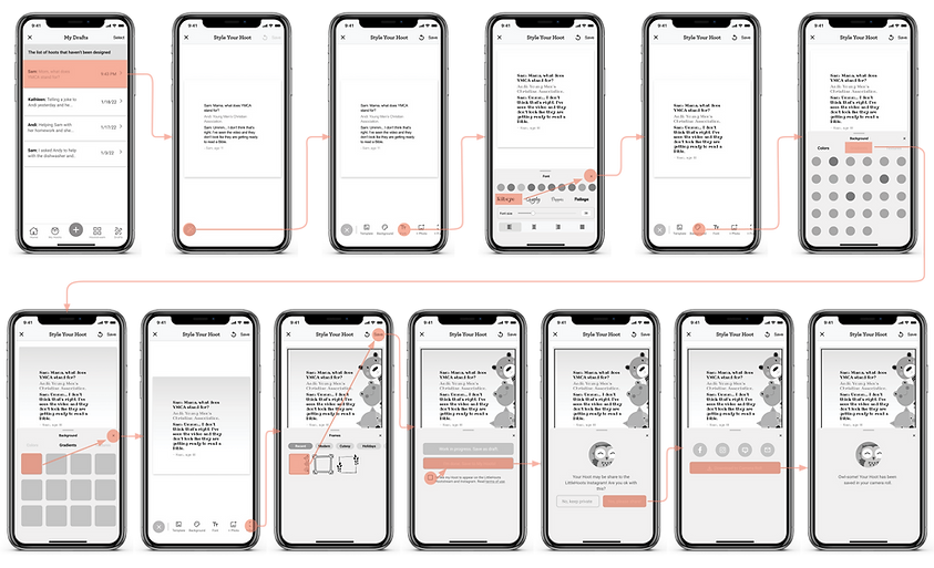
In order to help busy moms, we implemented the following new features. Also, here is link to the prototype.
An iPhone widget for quick draft access right from your home screen.

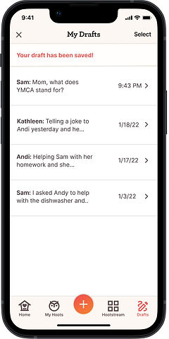

Easy and intuitive steps for drafting on the go.
Easy access to draft the memory from iPhone widget and intuitive steps for drafting for all the busy parents.
One stop shop concept for holiday gifts right from the app
Allows parents simply select their Hoots and send to partnered print shop directly in order to avoid any extra hustles between apps
Inspire creativity and design ideas through customized template
Allows parents to be creative designing their Hoot on their own
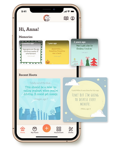
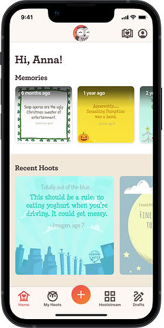
Adding memories to resurface and remind you of past Hoots
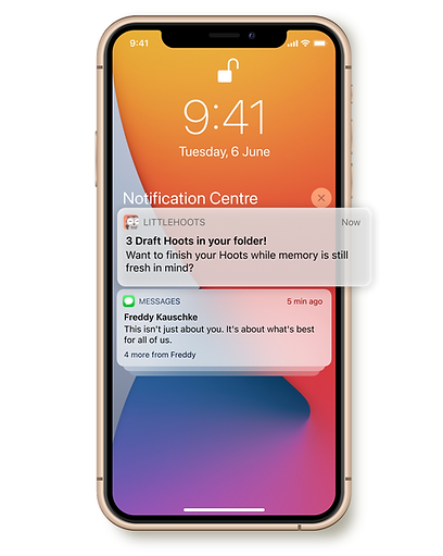
Push notifications to remind you to finish drafting your Hoots
How did we get there?
Our Game Plan
Our team kicked of the project by setting out the game plan:

RESEARCH

SYNTHESIZE

IDEATE

DELIVER
Understanding the Problem
Get to know the Business
Our team conducted a Competitive Feature Analysis to understand how other apps and memory keeping tools compare to LittleHoots’ current offering. Our analysis shows that LittleHoots has traction and a competitive advantage in the memory keeping department, particularly with text and written-based memory.
We also performed a heuristic evaluation to assess the usability of LittleHoots’s existing mobile app and consider whether it is in compliance with recognized usability principles. We learned that LittleHoots’ overall interface exhibits minor usability problems that need to be rectified.
To keep this competitive edge, there are some key features to the app that we'd like to make essential:
An editing tool to give more control
Flash back / create slideshow
Clear taxonomy (labels and naming)
Notifications of recent memories
Family sharing / collaboration
Better usability
interface
Ability to share directly to social media platforms
Sync to any cloud-based storage
Color usage leading to primary call to action
Hearing from the Users
We continued our exploration into understanding the goals and desires of prospective users and the experiences of existing users. Our team interviewed both user sets within our target market. We conducted interviews with seven existing users and seven prospective users, as well as conducted five usability tests on the existing mobile app. We captured incredible notes about our target audience’s behaviors, opinions, pain points, values, and more — which will be crucial in our next stages of synthesizing research.
From our prospective user research, we learned:
"I prefer to use
existing social
media app..."
Mother with a twins
"I print photo books and calendars with Chatbook on special occasions."
Mother with a 3-yr old
"I need a better organization system for photos. I save everything in my camera roll."
Mother with a 2 yr old
"I forget when milestones occurred. I love seeing memories resurface."
Mother with 2 kiddos
We talked to a variety of existing users, ranging from power-users to those who no longer use the app. We found:

"I need a easier way to turn my Hoots into photo book."
Existing User

"Love how simple LittleHoots is. But I want new designs and would love to customize them."
Power user

"I'd like to be able to save Hoot draft instead of using notepad."
Non-existing user

"All my friends and family are in IG. I don't need another social platform. "
Power user
Identifying Our Users
With all these research findings, we went on to develop a fictitious person that helps personify a representation of our target audience.
Anna
Age 40 • Married with 2 kiddos • Austin, TX • Accountant
Doesn't want to miss a single memory with her kids. Recently adopt the LittleHoots app. But she’s looking for a bit more—she wants a tool that helps her keep track of memories and share them with family.

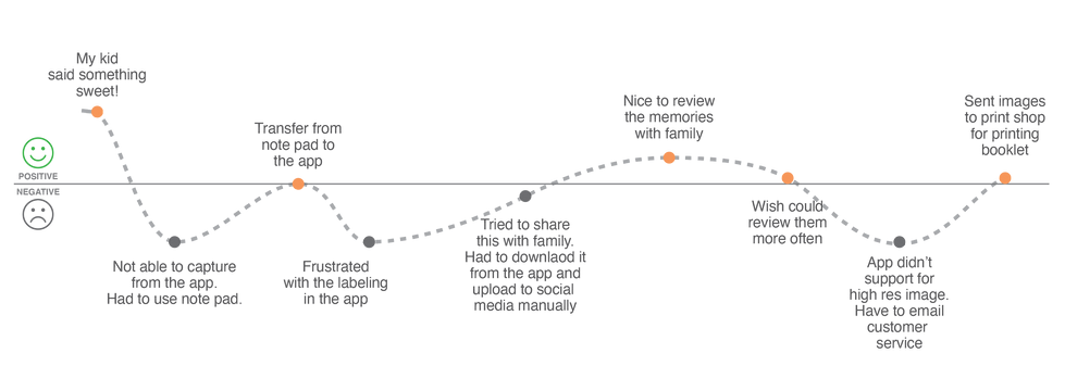
To better understand Anna’s pain points and the challenges that she experiences on a day to day, we created a journey map of how Anna, as a new LittleHoots user, would capture, create, and share her memories of her children.

Our Design Process
We rapidly designed screens to represent a series of user flows and goals that related directly to Anna’s needs as a user. Everyone in the team created a concept for each task, which rendered us with around 20-30 sketch concepts over two iterations. We finally landed on some of the key screens and user flows that would best fulfill our persona’s needs and goals.
Defining a Solution
We conducted two UX methods — the MoSCoW Method as well as the Feature Prioritization Matrix — to help us prioritize the features we wanted to deliver in our product. We decided to design a MVP (Minimum Viable Product) with the needs of our persona, Anna, in mind.
Here are the design framework we focused on:
01
Drafting function for future editing
02
Customize designs
03
Reminder of past milestones
04
Easy process to print a booklet
Ready for ideating!
To assist our team and bring the design to its final prototype, I researched and developed a style guide to improve the accessibility issue on the current app.

We wanted to test our new designs out with real users within our target audience. We interviewed 15 total people in three rounds of testing — first with Mid-Fidelity that help us garner feedback, then with two rounds of High-Fidelity prototype. Through tests, we discovered that our tasks were mostly completed, though there were several user challenges that we unveiled that could improve our design.
What did we learn from testing?
/01 Adding A Child To User Profile

Users found the task straightforward and easy in the first round of usability testing. However, in the second round of testing with our high-fidelity design, people tended to click on the buttons on the footer tab instead of the account icon on the top right. We suggest including a tutorial to instruct users to add family members via account.
/02 Capturing The Conversation With A Child And Saving A Draft
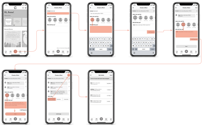
We found that users were having a hard time with the labeling and the user flow was not intuitive to users in the initial testing. Our team decided to change the process to improve the usability.
Our change started with letting users choose the participants of the conversation first. We then modeled the conversation UI off of a typical texting layout for learnability. After the user enters the first conversation, the system will automatically select the alternate speaker, which decreases the number of clicks/taps for users.
In the second round of testing, users found it easy to navigate through the task.
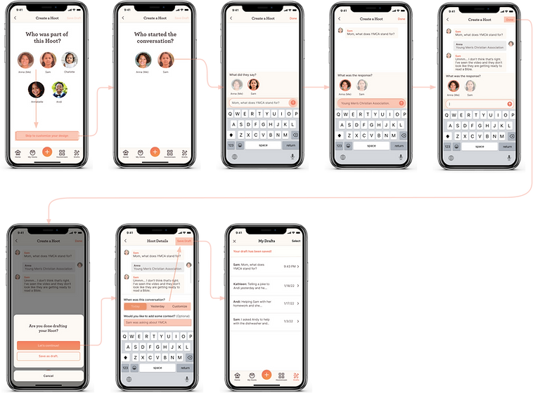
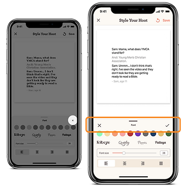
/03 Custom Design the Hoot
Some users were confused by the X on the design tool overlay and thought it could cancel their selection. We decided to add a checkmark on one side and move the X on the other side of the toolbar. Also, we found that the tab style in the toolbar was not visually obvious to users.

/04 Creating A Photo Book

Users found the flow and process very easy to follow. However, the send button at the bottom was confusing to them. We tried a few rounds of iteration on users and landed on the design with the word “DONE”.

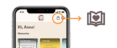
Users also did not associate the shopping bag icon with creating a photo book, so we changed this to a custom book icon.
Impact
With implementing all the changes, we ran the third round of usability testing by recording time on task, easiness rating, and the directness of success. Here's how our design improved people's experience:
Here’s what a few users said:
"Wow, this is so cool! it makes it so easy to remember those funny thins that kids say when they're young."
"What a cute idea for parents to collect their kids' memories - I would absolutely use an app like this to also put memories into a book."
▲7%
▲20%
▲11.5%
Continuing to Enhance the Experience
We successfully handed off our specs and deliverables on January 28, 2022. Our client, LittleHoots, was satisfied and excited about our work.
Our next step is to pass our research, insights, designs, and recommendations to the LittleHoots team. We suggest implementing the design updates (to the extent that resources allow) as well as the following recommendations:
-
Create a tour/tutorial for new and existing users when they open the app, to get accustomed to new design updates
-
Conduct additional rounds of usability testing, particularly with existing users to understand their experience and learnability of new app
-
Integrate Instagram within MyHoots
-
Develop partnership with Chatbooks or other printing services
After Thoughts
Working on a project that can help parents, especially moms, was a rewarding and insightful experience. I also enjoyed working collaboratively with my team. We all came from different backgrounds, yet we worked proactively to complement each other’s skills.
Our many rounds of usability testing taught me to think outside the box and approach problems from a different angle/way in order to find new solutions.